
The logo is one of the most important aspects of a business. It’s how you get known, and how people get to know you. Being one of your business cards, it’s important to have a well planned, well thought out and well-designed logo. In this section, we’ll provide you with a set of rules you can follow to make sure your plumbing logo will turn out great.
In this article, you’ll find:
- Plumbing logo guidelines
- Plumbing logo resources
Logo guidelines
1. Clear and uncluttered
It’s important for your clients to clearly distinguish every letter and line of your logo. We know that first impression is extremely important, but you should try to not clutter your plumbing logo with every service you provide. The logo should be informative of your business, but should not take the place of a brief with the services you provide.
For example, check the logo below.
![]()
If you can make out the name of the brand then you deserve a prize. What the company wanted was to use elements that are representative of their business, which is ok. The thing is, they’re too close to reality and not abstract enough, which makes it hard to form an uncluttered logo. Not to mention the distracting colors.
![]()
The logo above meets both our criteria for being clear and uncluttered. As you can see, the font is airy, rounded and keeps the same style as the faucet. Not only this, but the font does not blend in an unnatural way with the faucet.
2. Choose the proper colors for your plumbing logo
It’s important to use the proper colors in your logo. We’re not saying that it’s a must to use either blue or red for your logo (for hot and cold water), but we believe it’s to be expected of a plumbing logo, especially from the client’s perspective. As a general rule, it’s best to use the established colors of your domain.
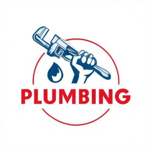
This plumbing logo perfectly encompasses not only the principle of proper colors but also the first one about being clear and uncluttered. The blue and red colors properly represent the domain. Not only this, but the plumbing logo almost says everything it needs to about what the brand is all about so that the client can make it all out in an instant.
3. Choose the right font
Generally speaking, there isn’t a specific font you should use for a specific domain of activity. There is a wide range of fonts that you can use for your plumbing logo, but we believe there to be two important aspects you need to take into consideration:
- Uncluttered font
- Gut feeling
Let’s take the first one, as it’s more easily analyzed. As we’ve mentioned in the first principle, it’s important to keep your font uncluttered. It’s better to have the letters more spaced out than too close to each other.
Regarding the second one, we believe that there is some science behind choosing a proper font, but that the best choice is taken by your gut feeling. For example, even if all the science in the world brought arguments that ?????? font is the best one for your plumbing logo, you would still trust your gut that it’s not the best decision for your business.
4. Proportions
We’ve evolved to appreciate symmetry, and that’s why we want to write here about the last aspect we find important in designing your plumbing logo: proportions.
There should always be a good ratio between the font and the illustration of your plumbing logo.
There are no ratios set in stone, and you can mostly go by your gut feeling again. Also, a few opinions couldn’t hurt. But mostly, if it’s visually appealing to the eye and the proportions are subjectively attractive, they’re probably well distributed.
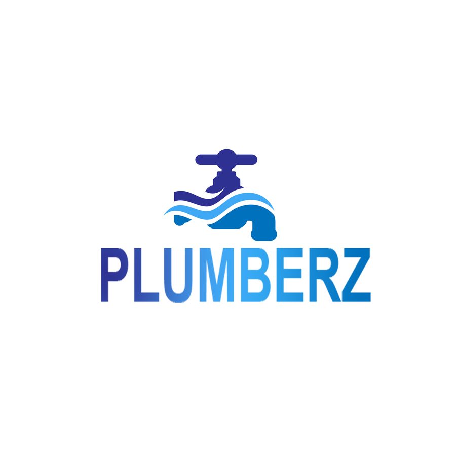
For example, the plumbing logo above is appropriately divided between the font and the illustration, creating a pleasing symmetrical visual experience.
These are the four guidelines we believe that if you follow them, you’ll have a great plumbing logo in no-time. Plus, you can take these guidelines to a professional designer or agency and they are bound to make you a great plumbing logo as quickly as 1-2-3.
If a designer or agency is too expensive for your budget, you can also try to do it yourself. We’ve gathered three resources that can help you develop your own plumbing logo, in a professional way.
Logo resources
1. DesignEvo
DesignEvo is a very simple and straightforward tool to generate or build your dream logo for your plumbing service business. It’s probably the most straightforward solution on our list. All you have to do is to click one button and then search for plumbing and select an existing plumbing logo model or create your own from scratch. After that, you can edit your logo as you wish and even save a low-resolution logo file for free.
2. Canva
Canva offers a logo editor that is in part similar to the one provided by DesignEvo, but it has more functionalities and capabilities. Canva is an online design editor that you can use to design pretty much anything, plumbing logos included.
3. Logodesign.net
With LogoDesign you can start creating your plumbing logo right away, but you have to create an account in order to download your logo.
That’s it for today! We hope you liked our little guide and that it will help you choose the best logo for your plumbing business.
Related: The Best Scheduling App for Field Service Professionals
Need more than a logo guide for your plumbing business? Check our free scheduling app that’s specifically tailored to field service professionals like you! Schedule your jobs, set automated text reminders for your clients, check work history, take notes and photos from the job site and many many more! You can download FieldVibe today for free (check the links below).